The emblem of a bitten apple on expensive and fashionable devices today will surprise few people. It is clear that Apple's apple logo symbolizes not only good taste, but also the financial wealth of its owner. True, few people know the history of the creation of the logo. This is what we will talk about now.
Piece of art
In its first year, Apple Computers used a completely different logo, which depicted a scene from the life of Isaac Newton as he rested above an apple tree. There was also a line from W. Wordsworth’s poem “The Prelude”, which talks about the thoughts of the scientist. But Steve Jobs' friends rejected this logo, unanimously saying that it was simply unrecognizable for the computer market, so it should be changed to something lighter.
Apple week
Then the matter could not have happened without an advertising agency. In 1977, Jobs turned to his friend, the director of Regis McKenna, with a request to help create a logo that must include an apple. Designer Rob Yanov zealously got down to business, and for a week he ate exclusively apples in order to wait for that one creative idea that is now pleasing to the eyes of followers of Apple Computers.
Steve liked the current logo, but the monochrome design had to be changed to brighter shades. The thing is that Jobs planned to flood the market with color devices, so in this case the shade of the apple mattered. Printing costs did not frighten the future billionaire.
Myths of the “rainbow apple”
The multi-colored logo has given rise to many rumors and legends, all of which are related to non-traditional orientation. Many said that the rainbow symbol meant support for sexual minorities throughout America. But it is known that the first mention of the rainbow flag - a symbol of homosexuality - was a year before the appearance of the bright Apple Computers logo. As you can see, there is little connection.
Others whispered that the bitten apple would canonize the death of mathematician Alan Turing, who faced a couple of years of imprisonment for homosexuality. True, he did not live to see the trial, but simply injected poison into the fruit and bit into it.
And again monochrome
For more than 20 years, the multi-colored logo has symbolized Apple. But in 1998, Steve returned to the company, which at that time was in debt and was unlikely to think about opening an Apple Store in Prague. It was in those years that the company so needed radical changes, which Jobs carried out. The latest development, the iMac G3 case designed by J. Ive, simply saved the company from ruin.
The technology that entered the computer market has become simply iconic. She was sold like hot cakes. She has appeared in magazines, newspapers, and even in films! But most importantly, in the hands of numerous fans from all over the globe. It was then that the company's management changed the logo to a monochrome sample, because bright colors would look more sloppy. This is how we still see him. So, by doing
On the pages of our website we have already talked about the history of the creation of the store, as well as the voice assistant. Today we will talk about an equally important thing - about Apple logo, which is known throughout the world. Not everyone knows exactly how the MacBook Pro differs from the Air, but almost everyone instantly recognizes the logo in the form of a bitten apple. In this article we will talk not only about who and when it was created, but also what the company’s earlier logos looked like.
So, Apple's first logo was completely different from today. Him in 1976 created by the third co-founder of the company Ronald Wayne, who is rightfully considered one of the biggest losers of the 20th century. The fact is that he sold his 10% stake in the company 11 days after its registration. Given Apple's annual growth, Ron would now be a billionaire, worth about $40 billion.
![]()
The logo depicts an English scientist Isaac Newton, on whom the apple will soon fall. On the edges of the logo you can see the inscription: Newton... A Mind Forever Voyaging Through Strange Seas of Thought... Alone (Newton... A Mind Forever Voyaging Through Strange Seas of Thought). This is a line from William Wordsworth's autobiographical poem "The Prelude." It is worth saying that the logo turned out to be very interesting and unusual, but completely unsuitable for a technology company. So in less than a year Steve Jobs contacted a graphic designer Rob Yanov, who was required to create a modern, recognizable and good-looking logo.
![]()
The result is a well-known bitten apple, which is still the Apple logo today. However, then, in 1976, it was multi-colored. The colors were not chosen by chance: they symbolize the fact that Apple in those years was one of the few to produce computers with color monitors that could display six colors. They found their place in the logo, and the colors are arranged in a completely random order.
IN 1998 year, welcome back to Apple Steve Jobs the logo was changed to a single color black, which we can still see on our Macs. It looks concise and simple, reflecting very well the basic idea of all Apple products. However, on WWDC 2012 the company used a different, very unusually colored logo.
![]()
I must admit that it looks very nice, but it is stupid to expect that the company will change the logo again, since another option was used. Apparently, the company will delight us with new versions of the logo every year. WWDC, indirectly reflecting the direction of development for this year.
Well, as we see, the logo of the most famous company in the world has come a long way before reaching its final version. However, we need to thank for its creation Rob Yanov, who owns the very idea of the bitten apple, so well recognized today throughout the world.
But few people know that Apple is a Freemason company. Let's look at this with facts and Apple symbols.
Steve Wozniak
Steve Wozniak is a Freemason. He is one of the co-founders of Apple. Wozniak joined the Masonic lodge in 1980. Alice, his wife, encouraged him to do this by joining the Order of the Eastern Star, and Wozniak followed her.


Apparently Wozniak is a Scottish Rite Freemason
This information is not particularly advertised, although Wozniak himself does not hide it. Everyone has watched films about Apple, read biographies, and nowhere is there a strong emphasis on this fact.
Apple App Store (application store). The App Store logo is a stylization of the symbols of the Freemasons (compasses).

Apple computer cost
Price of the first computer; It is believed that Wozniak invented it. The price of the Apple 1 computer was $666.66. Strange, isn't it? Why couldn't the price be set at $444.44, $777.77, or $888.88?
iCoin
Coins issued in 2013 in Ukraine in honor of Jobs and called iCoin. Symbols - the all-seeing eye on a compass, the compass itself, a triangle, the letter S in the form of a snake. S can mean either "Steve" or "Serpent" (snake). The snake is the ancient serpent-tempter who tempted Eve to taste the forbidden fruit.

Phi number
Another interesting detail on iCoin is the visual representation of the number Phi. Freemasons are obsessed with geometry. They call the Creator the Great Architect. They revere and respect geometry; This secret knowledge was inherited from time immemorial. Phi is a universal number in geometry. This number is constantly found in nature and in the Universe in general.
The number Phi can explain the pattern of a sunflower, the shape of our Galaxy, etc. Phi number is 1.618.

“The key to the physics of the cosmos,” this is what Plato once said, referring to the phi proportion. We see a visual representation of this proportion on the iCoin coin, in the place where the clock and circles are depicted.
Apple logo
Apple logo. The company says that their logo is associated with Newton, who, according to legend, an apple fell on his head. But in fact, a bitten apple could hardly fall on Newton’s head.

Another version seems more plausible. Namely: Eve bit the apple and gave it to Adam to try. Although nowhere in the Bible does it say that the forbidden fruit was an apple, in the Christian tradition for some reason it is generally accepted that this is so.

Thus, for biting the forbidden fruit, Adam and Eve were expelled from Paradise. We see that the object of temptation was the forbidden fruit, the apple, and therefore the Apple logo can be regarded as the idea of seducing its customers.
i
The word "i" (I) in English sounds the same as the word "Eye" (eye). The eye can simply be regarded as an all-seeing eye, which is of great importance in the symbolism of Freemasonry. Based on this, we see a completely different reading and meaning of the familiar ones: i(eye)Tunes, i(eye)Phone, i(eye)Pad, i(eye)Mac and so on.

For example Apple symbols, we see that corporations with Masonic roots or influence are actually operating in the world. There is no need to repeat that, in fact, every major corporation or world-class company is associated with the Illuminati or Freemasonry. This is an indisputable fact. This is the reality today.
Used by commercial organizations to attract the attention of buyers. Any company tries to acquire an original insignia, but, unfortunately, not everyone succeeds. The famous “bitten apple”, which is the logo of the world’s largest company producing computers, phones and software, is one of the five most recognizable emblems in the world. And over its history, the Apple logo has undergone many changes.
A few words about the company
The official date of creation of the company is April 1, 1976. The founders of the company are three Americans: Steve Jobs, Ronald Wayne and Steve Wozniak. Friends who managed to assemble a PC with a “MOS Technology 6502” processor and, having sold several such samples, obtained funding and officially registered their company.
In the beginning there was Newton and the apple

- simplicity
- modernity
- good recognition.
A week later, the designer presented the finished work to the customer: a colored apple with a bite. To create the image, Yanov bought apples from a nearby store, put them on a plate at home and made sketches, constantly trying to remove more and more unnecessary details. It was decided to make the apple bitten in order to distinguish it from other similar fruit and berry crops.
Speculation and rumors
Apple's colored logo has given rise to various rumors that the company supports sexual minorities. But supporting the LGBT community, the company did not seek to openly advertise this with its logo. If gays chose the image of a rainbow as their sign, then this has nothing to do with the multi-colored Apple apple. Rob's work was created much earlier than these events.
Also, those who like to look for hidden meaning in everything began to claim that the colored apple is a tribute to the memory of the Englishman Alan Turing, the famous mathematician and cryptographer.
Alan tried to fight fascism using his knowledge and skills, breaking the codes of secret organizations. When World War II ended, Turing became involved in developments in the field of artificial intelligence. But scientific works could not help Alan avoid criminal punishment for homosexuality. The scientist faced a difficult choice: two years in prison or hormone therapy. Alan was also deprived of the opportunity to study cryptography. As a result, Turing began to lead a reclusive life. At the age of 41, he committed suicide by biting into an apple laced with poison.
Why was the apple colored?

The logo designer urges you not to look for hidden meaning in the color scheme. Rob claims that the logo he developed reflected the company's scope of activity. Apple produced a PC with a color monitor - that's why it's an apple and colored. Six is exactly what the display could convey in those days. Comparing an apple to a rainbow is unacceptable, because a rainbow uses seven colors, not six. Green is the only color that Yanov gave special attention to - first place. All other colors were randomly placed by the designer.
From color to monochrome

The painted apple has been attracting customers' attention to Apple products for 22 years. The company itself has undergone a number of changes over such a long period of time.
Problems began in the 1980s. First, the failure of the Apple III project, then the plane crash in which Wozniak was injured. Unable to cope with the responsibilities of a leader alone, Jobs invited John Sculley to work. But disagreements increasingly arose between the leaders. Steve was very worried about the company's problems. And although in 1985 Jobs and Wozniak received medals for the development of technical progress, Steve decided to leave the company. Which is what he did in the same 1985. Jobs was able to return back only after 13 years. The company at that time was in a deplorable state. The financial problems were so serious that competitors more than once advised the company to declare itself bankrupt.
Only a miracle could save the company. The design of the new building was such a miracle iMac G3. The author of the work was Jonathan Ive. Ive's new case design turned computers into candy. With his development, the industrial designer literally saved the company from ruin. A series of new all-in-one PCs became the basis for the development of the home computing sector. The compact case contains all the elements necessary for smooth operation. The computer was equipped with a webcam and wireless devices for receiving and transmitting data. For full operation it was only necessary to connect the keyboard and mouse included in the basic package. The computer came with a remote control to control the playback of multimedia files.
The new product gained enormous popularity among users. Computers with unusual designs have become an integral attribute of characters in films and TV series. Thus, the whole world learned about the iMac G3, which combines beautiful design and performance. Increased attention to the new product forced management to change the colorful logo, which looked out of place on an already colored computer. In 1998, it was decided to use a monochrome apple instead of a colored one. This replacement only added originality to the company’s logo.
What does the monochrome apple mean? The evolution of the Apple logo shows us that the company has matured. She went through difficult times, but was able to move on. The company continues to develop and delight fans with new developments.
Gratitude for the success of the logo
It is worth noting that Apple did not appreciate the merits of Rob Yanov. Although it is thanks to his services that the company’s products are recognized all over the world. But Jobs forgot the person who created the “face” of his brainchild. Having a huge annual income, one could somehow further distinguish the designer, as, for example, Phillip Knight, the founder of Nike, did. Ten years later, the company thanked the creator of its logo by donating a block of shares and an expensive diamond ring.
Send
The first Apple logo was created by Ron Wayne. This name says little not only to ordinary people, but even to geeks. Meanwhile, Ronald is the third co-founder of Apple, and also the biggest loser of the 20th century. He sold his 10 percent stake in the company for $800 just 11 days after registration. If he had not taken this rash step, Ronald would now be one of the wealthiest people in the world with a fortune of $30 billion. Analysts say Apple's value will triple in three years, which means Wayne may have lost about $100 billion simply by not believing in Apple.
The logo created by Ronald Wayne has nothing in common with the current one. It was a miniature work of art. In the center was the outstanding English scientist Isaac Newton, on whom an apple was about to fall (insight!). In the future, the “Newton theme” will be continued when Apple releases its PDA.
If you enlarge the logo, you will notice that along the border there is the text: Newton... A Mind Forever Voyaging Through Strange Seas of Thought... Alone (Newton... A Mind that sails alone through strange seas of thought). This is a line from William Wordsworth's autobiographical poem "The Prelude" that reads in full:
And from my pillow, looking forth by light
Of moon or favoring stars, I could be held
The antechapel where the statue stood
Of Newton with his prism and silent face,
The marble index of a mind for ever
Voyaging through strange seas of Thought, alone.
Translated it looks like this:
From my pillow, illuminated by the light
I could see the moon and good stars
On the pedestal is a statue of Newton.
He is holding a prism. Quiet face
Like the dial of a mind that's alone
Sailing through the strange seas of Thought.
 The logo turned out to be interesting (all these references to Newton, who really was lonely, a touch of mystery, etc.), but not very suitable for the realities of modern business. Therefore, Wayne's work was used for about a year. Steve Jobs then turned to graphic designer Rob Janoff for help. It was necessary to create a simple, modern-looking, well-recognizable logo.
Rob completed this task in about a week. In an interview with the Revert to Saved blog, Yanov talked about how the logo was created. Rob bought apples, put them in a bowl and began to draw, gradually removing unnecessary details. The famous “bite” was made on purpose: the logo had to be drawn so that it would be strongly associated with apples, and not other fruits/vegetables/berries. The similarity of the pronunciation byte/bite (byte/bite) also played into its favor.
![]()
Rob Yanov made the logo in color, which provided good ground for speculation and myths. The most common one, actively supported by Win and Linux users, comes down to the fact that the Apple symbol reflects support for sexual minorities. This is not entirely true. Apple truly supports the LGBT community, as evidenced by recent video, however, the color logo was created a year before gays began using the rainbow as a symbol.
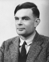 The second myth is even more interesting. They say that an apple painted in the colors of the rainbow is a kind of sign of respect to Alan Turing. Turing is an outstanding English mathematician and cryptographer who made a significant contribution to the fight against fascism. During World War II, he cracked the Kriegsmarine and Enigma ciphers, and after that he had a huge influence on computer science (Turing test, work on the theory of artificial intelligence). Turing's merits did not save him from prosecution for homosexuality. Alan faced two years in prison if he did not agree to hormone therapy (which, among other things, led to breast growth and chemical castration). In addition, Turing was deprived of his most valuable asset: the opportunity to do what he loved - cryptography. As a result, Alan became a recluse, and then completely committed suicide. Moreover, the form of suicide was very unusual: Turing bit off an apple, which he had previously pumped with cyanide.
Rob Yanov refutes both myths. According to him, there is no need to look for a secret meaning. Apple's color logo was intended to reflect the fact that the company produces computers with color monitors. The Mac display at that time could display six colors. These colors were precisely indicated on the logo. There is also no pattern in the arrangement of colors. Yanov placed the colors in random order, only the green color was placed first intentionally.
The logo existed in this form for 22 years. In 1998, Steve Jobs, who had previously been ousted from Apple, returned to the company. Apple was experiencing huge financial problems at the time. Competitors sarcastically advised to close the shop and distribute the money to shareholders. Drastic measures were needed. And do you know what pulled Apple out of the crisis? Industrial designer Jonathan Ive has come up with a new case for the iMac G3.

![]() Computers that look like candy canes literally saved Apple. Moreover, they became iconic - their images appeared in films, TV series, and glossy magazines. It is clear that a colorful logo on a colored poppy would look stupid. Apple has moved away from using a color logo. So, since 1998, we have seen a laconic monochrome logo. The company has matured. And with her, so do we.
Computers that look like candy canes literally saved Apple. Moreover, they became iconic - their images appeared in films, TV series, and glossy magazines. It is clear that a colorful logo on a colored poppy would look stupid. Apple has moved away from using a color logo. So, since 1998, we have seen a laconic monochrome logo. The company has matured. And with her, so do we.
Rob Janow created an outstanding logo. This is not a banal insignia, but a real Symbol. But Yanov’s achievements were not particularly noted by Apple. At the beginning of this post I mentioned the Nike logo. It was created by Carolyn Davidson, a student and freelancer from Oregon. Nike, a young company at the time, paid $35 for the work. But ten years later, the company’s founder, Phillip Knight, presented her with an expensive ring with a diamond “stroke” - the signature style, as well as an envelope with company shares. Knight appreciated the designer's work, making her a co-owner of Nike (albeit with a small stake).